Negative Space Is Part of the Picture
Negative space in art can guide attention and shape a composition. Learn to read its contours, contrast and spacing to understand what a picture makes visible.
Negative space in art can make a vase seem to lean before its outline changes. Look at the wedge between the vase and the edge of a canvas: if that gap narrows sharply, the vase may feel pressed outward. The surrounding shape affects how the object reads.
The term does not mean a picture contains nothing. An unpainted ground, a quiet patch of colour or a loosely worked passage can all function as negative space. The useful question is what an area’s shape, tone and relationship to nearby forms make you notice.
What counts as negative space in a picture?
Negative space is the area perceived as surrounding or separating the subjects, rather than as the subjects themselves. It may be the sky around a tree, the gap between two figures, the opening inside a handle or the clear strip between a bowl and the edge of a table.
Artists do not always leave these areas bare. A background can contain brushwork, pattern or changes in colour and still function as negative space if it remains secondary to the forms it frames. The distinction is about how the composition reads, not whether the surface has been touched.
Shift your attention from an object’s outline to the patch beside it. That patch has boundaries too: the object on one side, perhaps the canvas edge or another form on the other. Compare its width, direction and contour just as you would compare the object’s features.
How does negative space guide attention?
Negative space guides attention through contrast, separation and the paths your eye can follow. A bright, open area beside a dark figure can make the silhouette easy to read. A narrow gap between objects can hold your gaze because the forms appear close to touching.
Space also sets a visual pace. Broad, quiet areas can give a crowded cluster room to register; compressed areas can make a composition feel tense or energetic. Neither effect is automatic: colour, edges and your knowledge of the subject also influence what stands out.
Think of negative space as the margin around a handwritten note. The margin is not the message, but its width affects how crowded the words feel and where the eye rests. In a painting, surrounding shapes similarly affect how a subject appears to sit, move or breathe.
How can you judge whether the balance feels intentional?
Compare the spaces on different sides of a subject, but do not expect them to match. A composition can feel balanced through unequal areas if their visual weight seems considered. A small, dark form may counter a larger, pale one; a sweeping empty curve may answer a tightly grouped set of objects.
Look for relationships rather than symmetry. Ask whether a figure is crowded against one edge, whether a gap points towards another object and whether an open area has a clear contour. Then notice how those choices affect your reading of the subject. An open patch may make a still figure seem isolated or leave room for the direction of a moving arm.
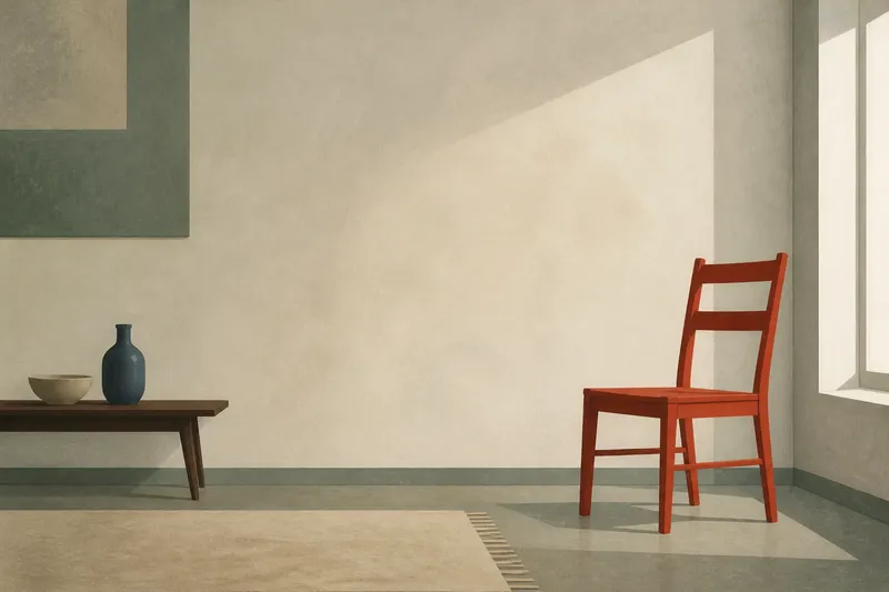
Say you are looking at an invented painting of a red chair near the right edge, with a low table on the left. First, compare the broad area behind the chair with the narrow gap between chair and table. Next, follow the direction of each shape and note which one attracts your eye. If the broad area remains quiet, the chair may seem set apart; if a strong pattern fills it, the chair may feel more connected to the room. The resulting reading depends on the marks in the imagined painting, not on a fixed meaning for empty space.
What should you check when reading negative space?
Scan the whole composition, then choose one gap and follow its outline. For a moment, avoid naming the objects. Notice whether the space is triangular, curved, pinched, open or interrupted, and compare its edges with the direction of nearby forms. Use these checks to make a decision about what the space is doing:
- Shape: Observe whether the gap is broad, narrow, angular or rounded. If its contour echoes a nearby form, decide whether that echo ties the forms together; if it does not, look for another relationship.
- Scale: Check whether the open area is large enough to draw attention on its own. If it dominates, decide whether it acts as a deliberate pause; if it competes without a clear purpose, look for how it disrupts the composition.
- Value and colour: Compare the space’s lightness and colour with the subject. If the contrast separates the forms, note that distinction; if the colours seem to merge, decide whether the artist is joining them visually.
- Edges: Observe whether the boundaries are crisp, soft, broken or partly lost. If a soft edge makes the gap less distinct, consider whether it blends areas; if the edge is sharp, check what it singles out.
- Direction: Follow the gap towards the next form or canvas edge. If it leads the eye onward, identify where; if it holds or pushes your gaze away, decide how that affects the subject’s apparent movement.
- Repetition: Check whether similar gaps recur between several objects. If they do, decide whether the repetition creates rhythm; if they vary, look for how the changed spacing affects the grouping.
Return to the whole picture after examining one area. A gap that seems awkward in isolation may echo another shape elsewhere. If an opening draws more attention than the subject, check whether that emphasis supports the composition or distracts from it.
Does negative space change across different media?
Yes. In painting, it may be a visible ground or a field of less-detailed marks. In drawing, untouched paper can define forms as strongly as lines do. In sculpture, openings between solid parts can be seen from different viewpoints, so their shapes shift as the viewer moves.
In a print or collage, a cut-out, blank patch or unprinted ground can become an active shape. Untouched paper may look different from a painted area that imitates paper. Ask what the viewer can actually see and how the medium defines the boundary between form and surrounding area.
What do readers often ask about negative space?
Is negative space always blank?
No. It can contain colour, texture or marks while remaining secondary to the main forms. Judge its role in the composition rather than treating “negative” as a synonym for untouched.
Can empty space become the main subject?
Yes. An artist may make a gap or opening the strongest visual event, particularly when its contour is distinctive. If your eye keeps returning to the space itself, it may be doing more than framing another object.
How is negative space different from the background?
The background is perceived as behind the subject; negative space is a broader compositional idea that also includes gaps between and within forms. A background can therefore contain several distinct negative shapes.
Why do artists leave some areas less detailed?
Reduced detail can help separate a focal form, suggest distance or prevent every part of the image from competing for attention. Whether it succeeds depends on how the quieter area relates to the rest of the composition.
What can negative space reveal about an artist’s choices?
Negative space in art can reveal how an artist distributes emphasis without adding another object. A large open area may give a small subject prominence through contrast, while a tight arrangement can make several forms feel interdependent. These choices shape a picture’s mood and structure, but they do not dictate a single interpretation.
For a second look, trace the boundary between a subject and its surroundings with your eyes. Then treat the surrounding patch as a shape in its own right and notice what changes. The gaps in a picture are made, bounded and arranged, not simply left over.